1.14.2013

Snapshots Preview


Finally have edited some photos of pass projects... found some clean snapshots preview.  What kind of this project? It will be launched later by hoo


Photos taken by me

Doo Wop | Louis Poulsen

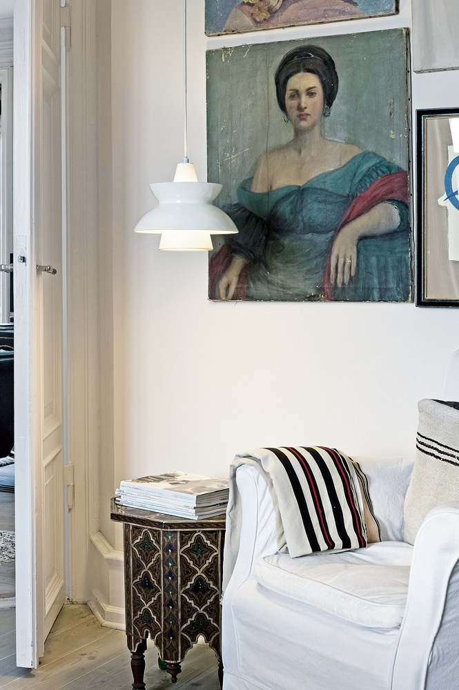
Louis Poulsen  is a well-known manufature of design lamp, which relaunched an old favourite, the Navy Pendant. It was originally produced in the 1950s, collaboration with the Navy Buildings Department but it was last seen in their catalogues in the 1980s. 
The new version has been called Doo-Wop

The choice of lighting plays a very important part in the final look of any interior design scheme. Get it right and the lighting will bring the scheme together, and should provide both atmosphere and task lighting when needed.

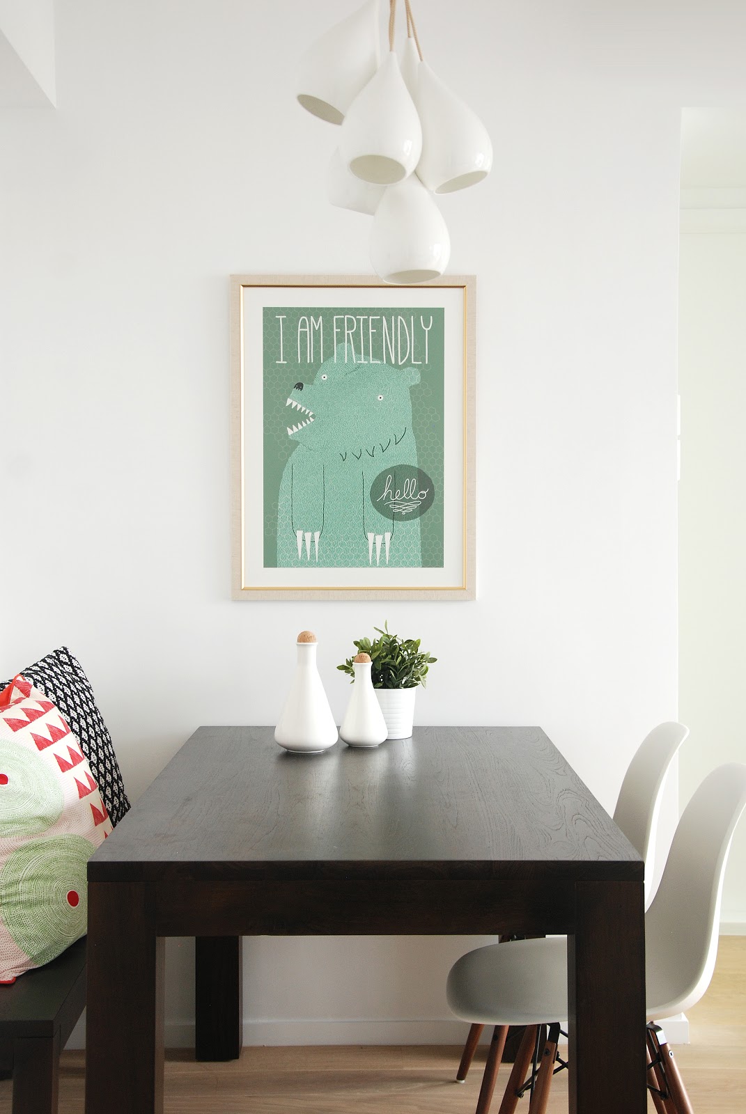
It s be arranged a one or in a row, or even randomly arrangement. It seems attractive lighting effects. Available as well as dining and kitchen, children's room, such as halls and stairs. All over the place s given a fresh style and good light in the space.

I quite like the brass one, stylish simply. 

Louis Poulsen  是一間知名的丹麥製造廠商,  他們設計的燈常全球性的設計師攜手合作,如建築師的 Verner Panton 和 Arne Jacobsen 設計。他們重最新推出了一個舊愛,古老海軍吊燈 Navy Pendant。它最初產生於50年代,與海軍屋宇署合作,但在20世紀80年代,亦是它最後一次出現在他們的產品目錄。

大家都知道,燈具的選擇是非常重要的一部分,在任何室內設計方案的最終外觀。做不同的事應該要有不同的照明,和有需要時,應同時帶來氣氛令整個空間變得有不一樣的效果。

Doo-Wop 夠樸實又和諧的設計。非常適合單獨掛去點綴某一個角落,一盞燈,排成一排,甚至是隨機排列的,似乎好有吸引力又有照明效果。隨手可得,以及餐廳和廚房,兒童房,如大廳和樓梯,所有的地方,給人以清新的風格。
我的選擇是金銅色!靚!


1.08.2013

Project Sheryl | Small lovely home


Small apartment in Hong Kong. I love this lovely home. 


Location: Diamond Hill, Hong Kong 
Size: 627 Square Feet 
Date of Completion: October 2012

Heart. Soul. Life. 

Interior design is the HEART of a home. Styling & decor is undoubtedly the SOUL. A mirror, a bottle, a poster, a cushion... together, they give LIFE to this lovely girl’s 2-bedroom apartment. Louis Poulsen, La Lampe Gras and Original BTC lamps, Magis and Eames chairs, not to mention ferm Living, Vitra and Seletti accessories – all perfectly paired for a comfortable, Scandinavian-inspired home.

www.facebook.com/homeofone


Designed by hoo
Styling by me and YC
Photos taken by me and YC

8.22.2012

Black & White & Color


Black & White with ...... 
Which one you like ?
with blue, yellow, red, green.......

黑白配咩好?
藍,黃,紅,綠........... ?


Via Bambula fm Suomi 

Divaani magazine by Finland


芬蘭的室內設計雜誌。Divaani magazine 

I Love Scandinavian.

好愛北歐的設計,自然簡潔!有家的感覺!
大膽運用顏色襯得出色! 
有主色,配用襯色又不會喧賓奪主
最重要又耐看!
我對香港的家居設計不太討好,
打開雜誌家家一樣,
沒一家看得上眼。
家對你來說是什麼?
用盡不同性質的物料及完素推砌起來,
炫耀給人看花了幾多錢去裝修,
每一個角落都要有設計,
為了什麼?

有些作品,一看張床單及抱枕的款式,
就知道你的個人品味,
與設計師幫你設計的家居完全不吻合,
花了多的錢,這個真的是你家嗎?

其實家品及傢俬的配搭真的好重要。


Working Desk Scheme


點樣襯好你的工作枱?
黑白灰好悶?想加點顏色?
不妨試下撞色吧!
Finnish blogger 介紹左用原木板配合黑色,
加上清新的薄荷綠及黃色的點綴,
變成了充滿藝術味道的新組合!

木板本身好好用,用作襯底,加上紙張及postcard,突出鮮色的薄荷綠。 


Related Posts Plugin for WordPress, Blogger...